
PROJECT NAME
Licor Pedraforca
PROJECT CATEGORIES
Brand & Packaging design
PROJECT NAME
Licor Pedraforca
PROJECT CATEGORIES
Brand & Packaging design
PROJECT NAME
Licor Pedraforca
PROJECT CATEGORIES
Brand & Packaging design
PROJECT DESCRIPTION
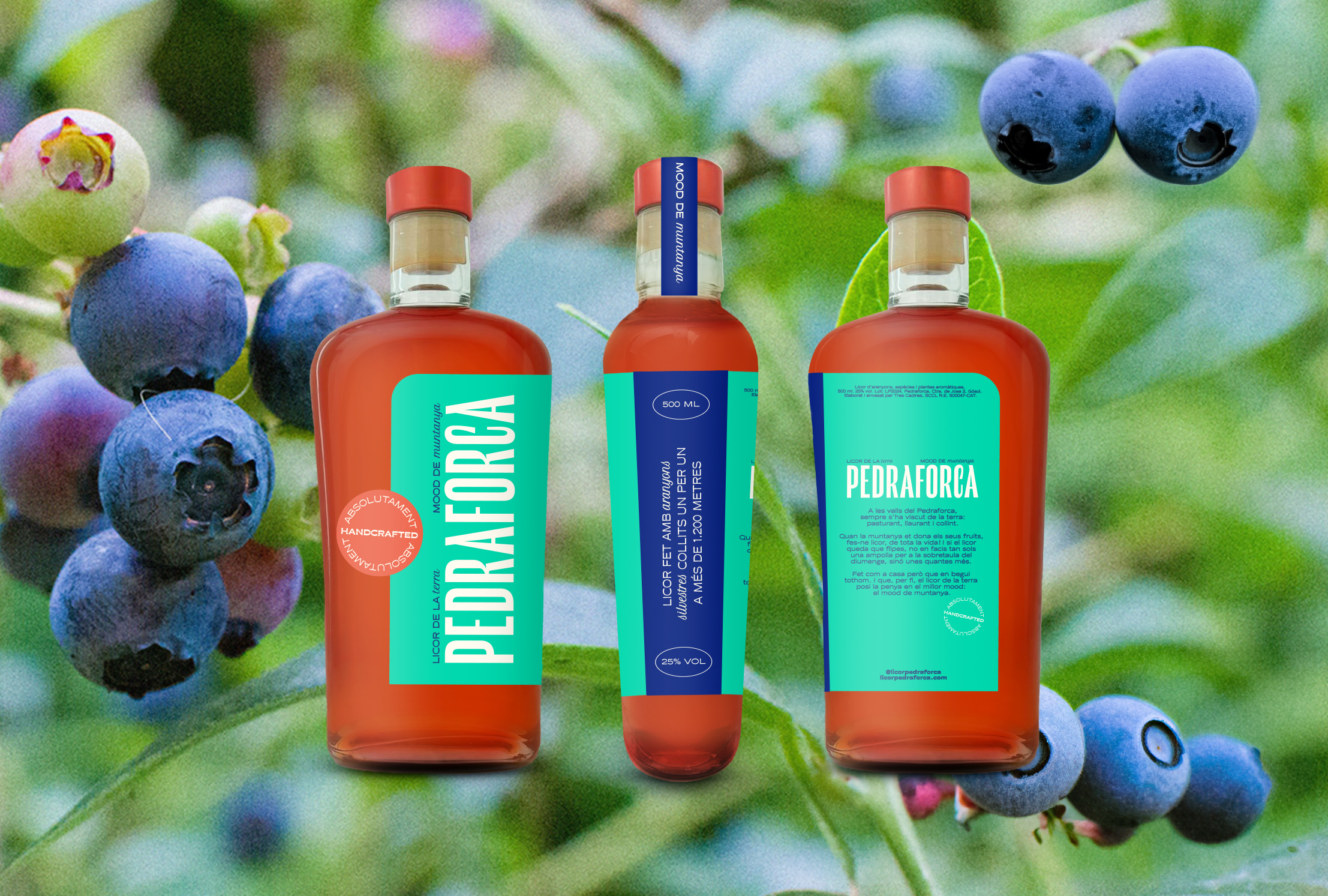
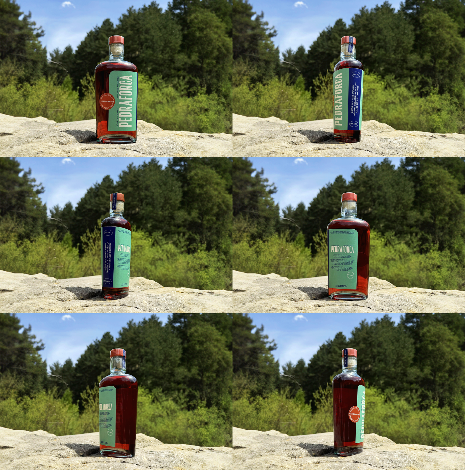
Licor Pedraforca is a traditional Spanish liqueur crafted from a blend of blueberries (aranyons), herbs and spices, named after the iconic Pedraforca mountain in the Catalonia region of Spain. Known for its rich, aromatic flavors, this liqueur is typically enjoyed as a digestif.
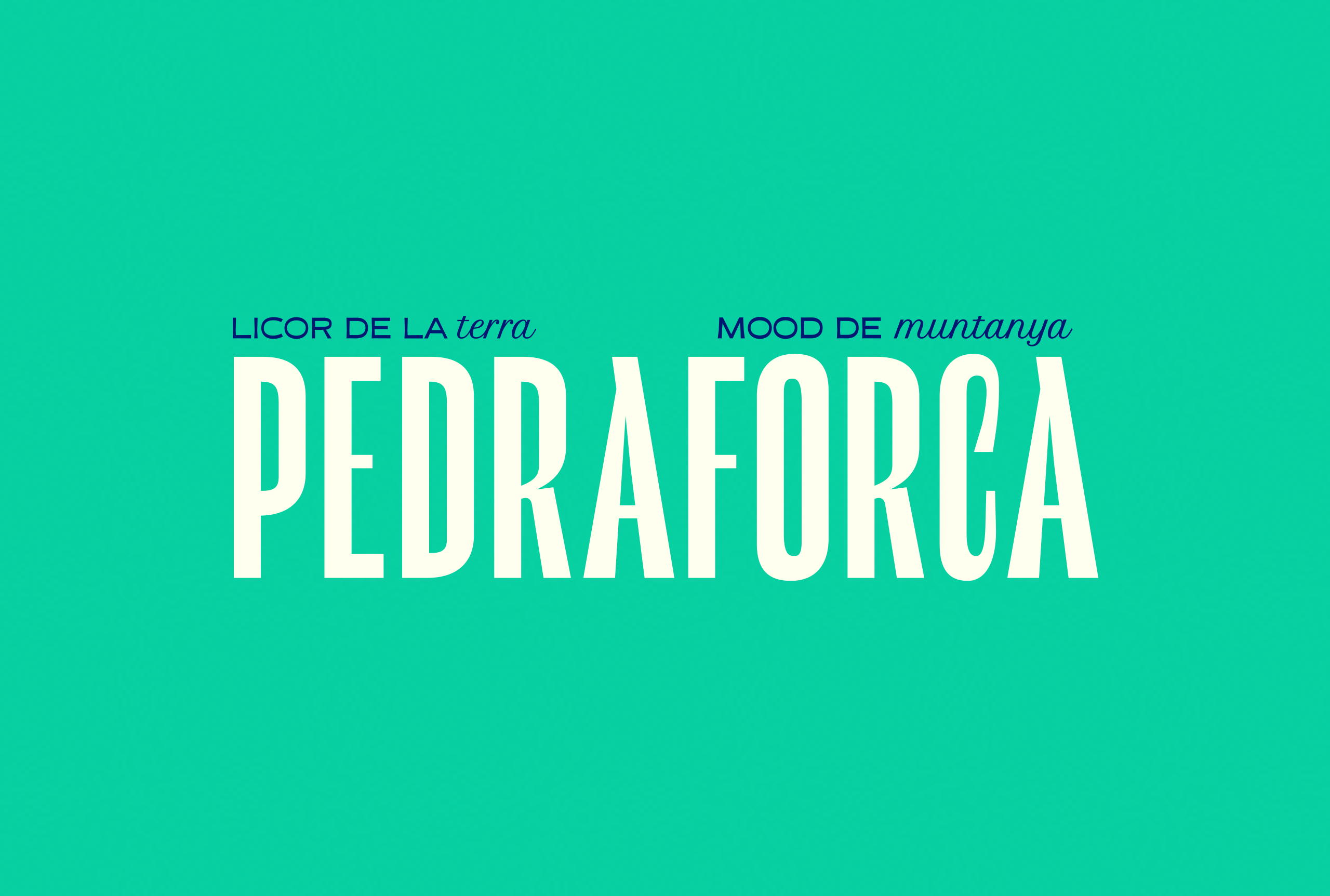
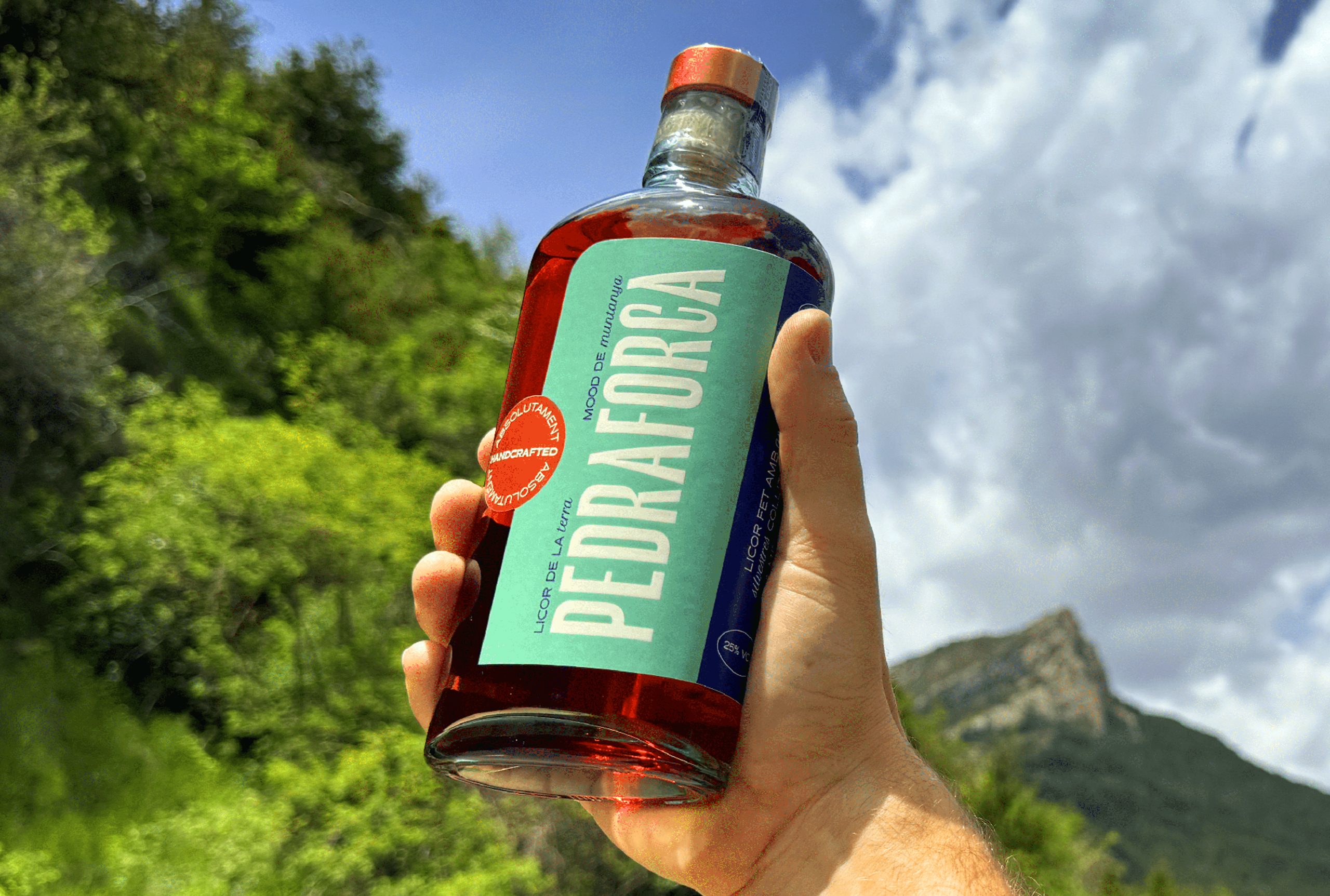
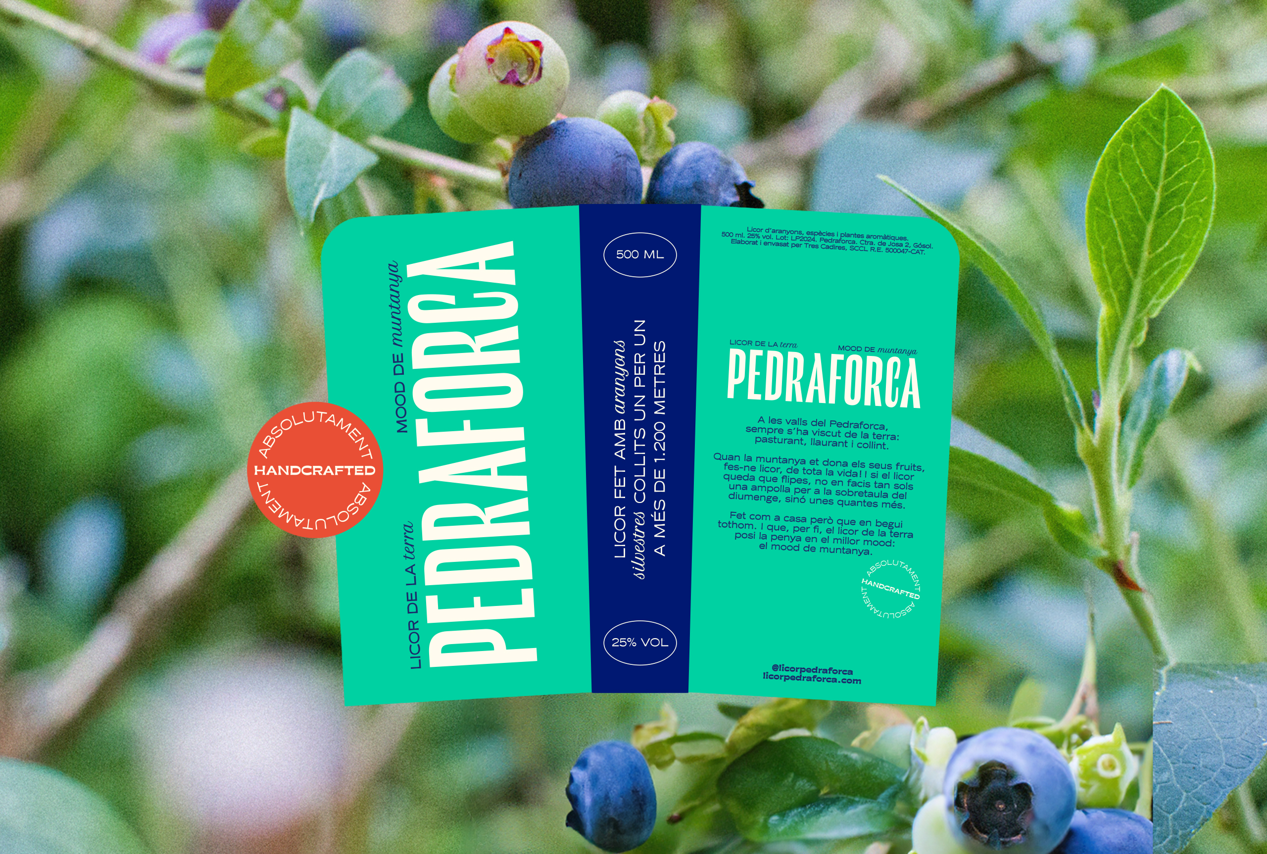
For this project, I was commissioned to develop the brand identity, with the label being the most crucial asset of the brand and product. The key challenge was to move away from the classic, traditional approach common in this sector, and instead, create a brand that stands out through a fresh and modern look and feel.
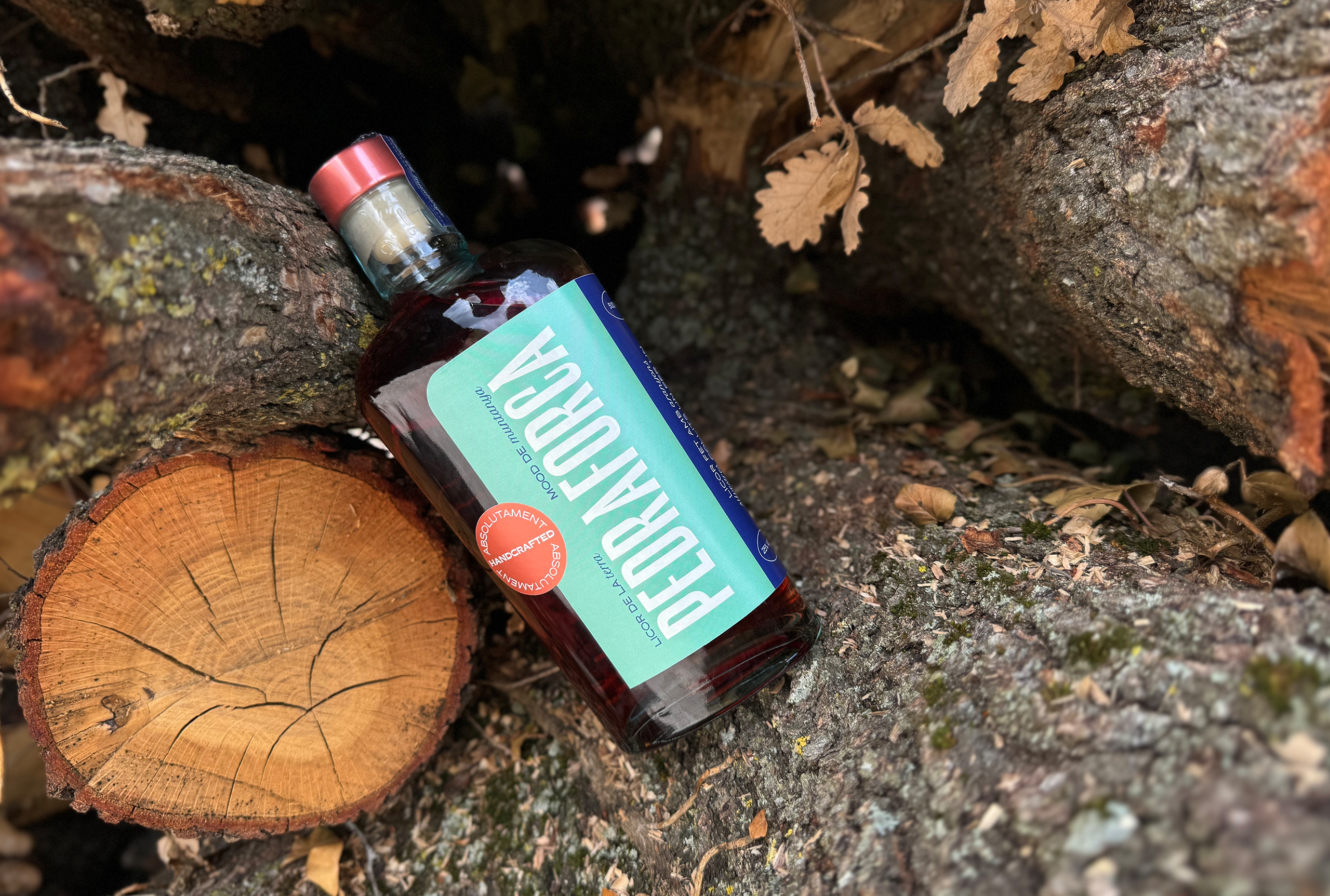
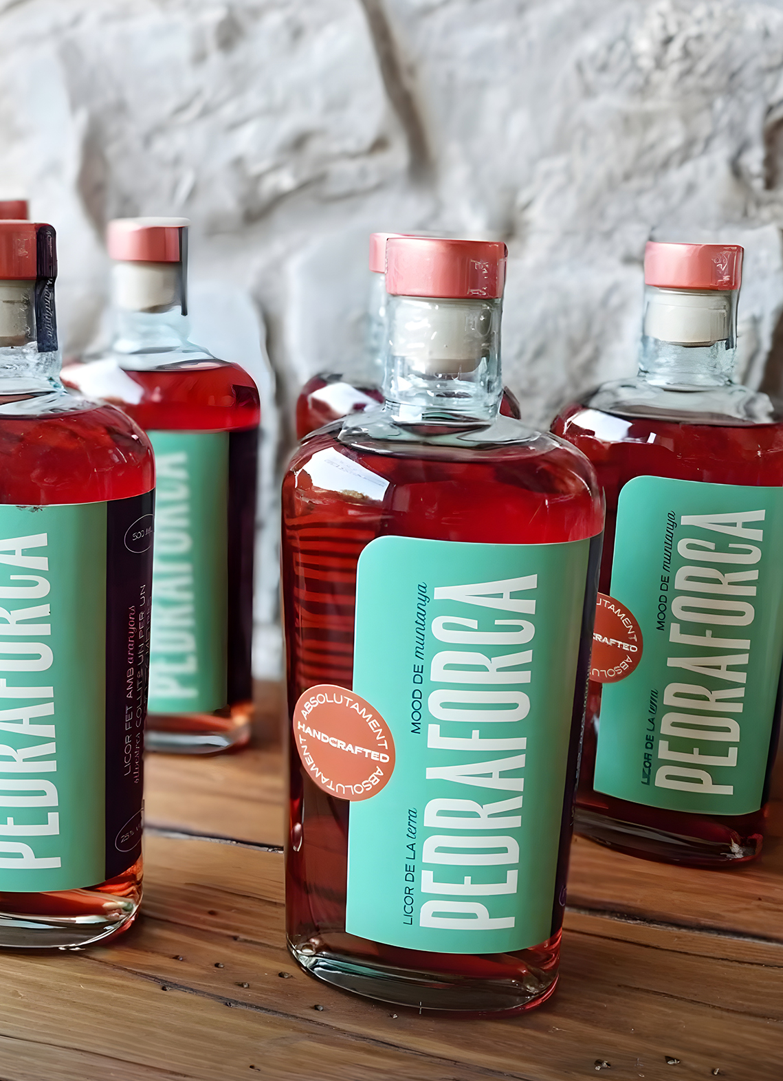
Inspired by the concept of a 'less is more' but with a bold touch, I designed a fresh and vibrant identity to ensure the brand communicates quickly and effectively. The main teal green color is inspired by the nature, while the blue is drawn from blueberries, creating a natural connection to the product’s ingredients. The copper tones introduce a striking contrast, and the use of metallic textures elevates the product’s premium feel. The typography, elegant and simple, serves as the foundation of the brand’s communication, enhancing its modern yet refined identity.
PROJECT DESCRIPTION
Licor Pedraforca is a traditional Spanish liqueur crafted from a blend of blueberries (aranyons), herbs and spices, named after the iconic Pedraforca mountain in the Catalonia region of Spain. Known for its rich, aromatic flavors, this liqueur is typically enjoyed as a digestif.
For this project, I was commissioned to develop the brand identity, with the label being the most crucial asset of the brand and product. The key challenge was to move away from the classic, traditional approach common in this sector, and instead, create a brand that stands out through a fresh and modern look and feel.
Inspired by the concept of a 'less is more' but with a bold touch, I designed a fresh and vibrant identity to ensure the brand communicates quickly and effectively. The main teal green color is inspired by the nature, while the blue is drawn from blueberries, creating a natural connection to the product’s ingredients. The copper tones introduce a striking contrast, and the use of metallic textures elevates the product’s premium feel. The typography, elegant and simple, serves as the foundation of the brand’s communication, enhancing its modern yet refined identity.

Other projects
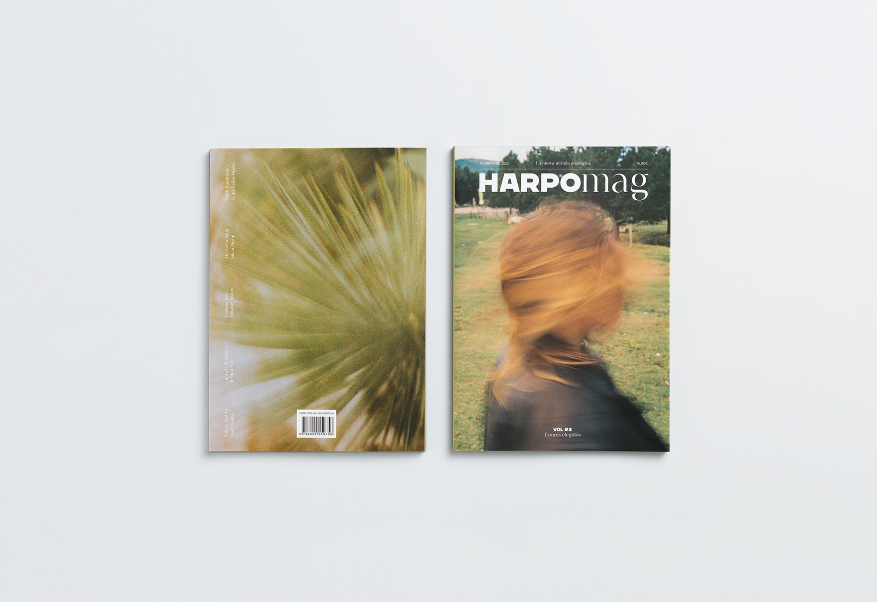
HARPOmag Vol. #2Editorial Design
36 Days of Type 2023Type Design
We are DottDigital design

Chewy the SlothIllustration

Tommy Jeans x Future BubblersDigital design

Windows from the NetherlandsPrint design

HARPOmag Vol. #1Editorial design

Wax & Boogie - Seven yearsPackaging design

Tommy's Drop ShopDigital design

EpitypephioPackaging design

Dott out of home campaignBrand design

Fashion Closet by MangoWeb design

VidaCaixaWayfinding System

SojadeBrand design

wallapop x Imborrable notebooksCorporate Design

LogofolioBrand design

Dott 4th AnniversaryEvent design

Milkyway MilkshakesPackaging design

Tommy HilfigerEditorial design

Wallapop OOHBrand design

Errante winesPackaging design

WorkplaceBuddyBrand design